BACKGROUND:
In 2020, Tallahassee Memorial Healthcare began their website journey. The team felt stifled by the inflexibility of their current system and outdated design. Additionally, they wanted a website that offered more automation so they could focus on bigger priorities.
SOLUTION:
To assist Tallahassee in developing their new website, I started by taking a look at what the team had at the time, what was working, and what wasn’t working. Together we did a deep dive into their branding and messaging so we could distill those points that were of supreme importance to showcase moving forward.
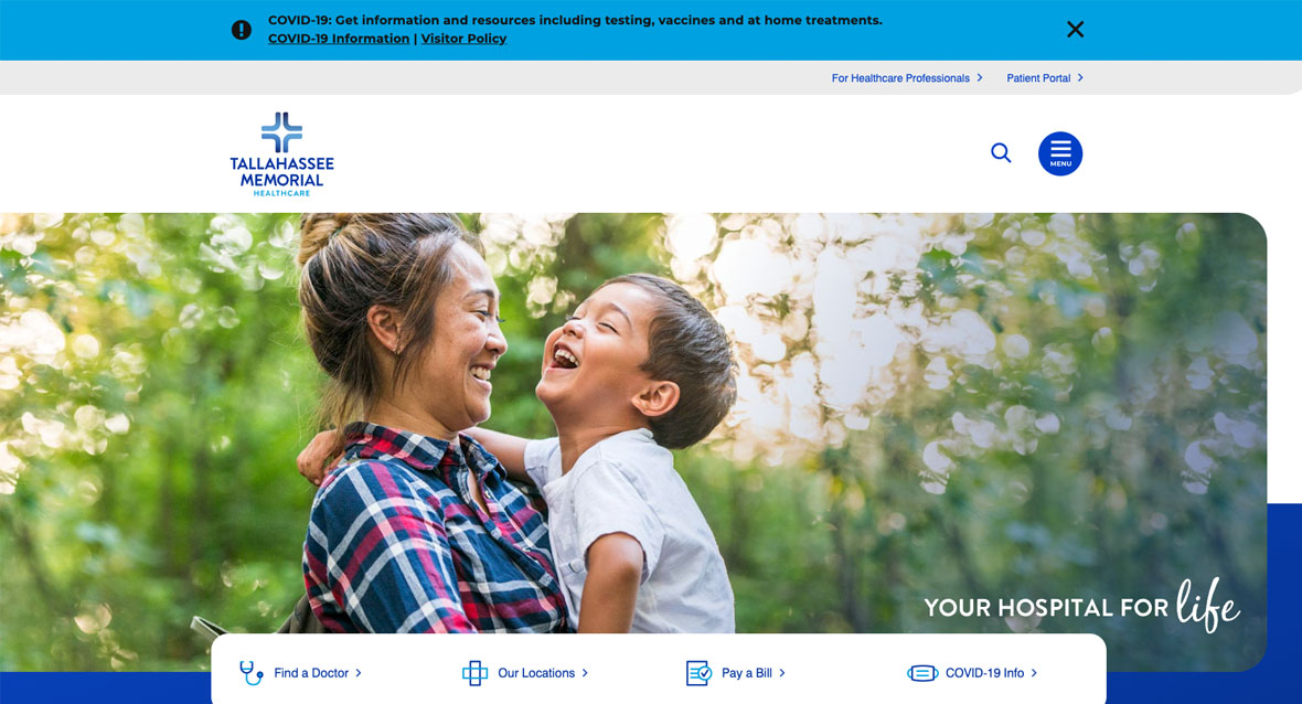
I also researched best practices, market opportunities, and service line strengths. After a thorough review, strategic assessment, and wire-framing, we proposed an engaging, beautiful design concept that allowed both the system’s personality and the unique branding of their service lines to shine through while keeping prime action-oriented CTAs clear and present.
We worked with their credentialing department to deep-dive into their provider data and clean up the information there in order to develop an automated feed from system-to-system.
The end result is a modern, fast-loading, and well-organized website, complete with strong CTAs, clean navigation, engaging graphics, and relatable imagery.
Project Information
- Client:
- Tallahassee Memorial
- Date:
- 27 Sept, 2021
- Category:
- Strategy, UX, Design, Web Development

