RIVERSIDE HEALTHCARE
BACKGROUND:
The Riverside Healthcare website, has been sitting stagnant, design-wise, for a few years. The Riverside team pointed out that users were calling in asking questions about where to find information online, because they were struggling to locate pertinent information on their own.
We decided to take a look at pain points and areas of frustration for their users. An analytical deep-dive and heatmapping proved that the main navigation was a large source of rage clicks and user exits. Additionally, the home page lacking excitement and color stopped users from scrolling very far down the page and interacting with the CTAs.
SOLUTION:
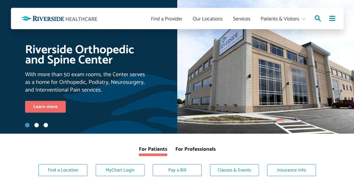
We took the heatmapping and analytical assessments and used that to make informed decisions about where we could improve the site performance and user experience. We created a set of quick links just below the main banner image for pages that were most often visited by site users.
We added visual cues to the background of the home page to help draw the eye along and keep users engaged.
We gave some depth to the footer to help call it out, whereas in its current state, it tends to blend in with the page content.
This site update is slated to launch summer of 2022.
SOME CLIENT DELIVERABLES:
Project Information
- Client:
- Riverside Healthcare
- Date:
- July 2022
- Category:
- Strategy, UX, Design Web Development

