BACKGROUND:
In 2021, North Kansas City Hospital opened a brand new location for weight loss management, Total Weight Loss Center. This new location required its own web presence offering a very retail-oriented experience.
SOLUTION:
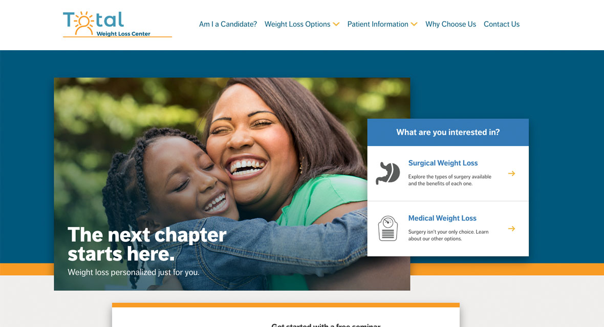
To assist Total Weight Loss Center in developing a new website, I researched competitors, best practices, market opportunities, and service line strengths. After a thorough review, we proposed a design concept using a set of unique calls-to-action (CTAs) in hand with a very simplified site architecture to drive users through the site in a meaningful, user-friendly, mobile-first way.
The end result is a modern, fast-loading, and well-organized website, complete with strong CTAs, clean navigation, engaging graphics, and relatable imagery. Users can easily find both surgical and non-surgical weight loss options and learn about the differences between the two.
WEBSITE FEATURES:
- Consumer-friendly interface including bright colors, ample spacing, custom icons, and subtle animations
- Flexible working spaces for a variety of content needs
- Accessible interface design across the entire site
- The site information architecture was developed to drive conversions by helping users determine which weight loss option is best for them
SOME CLIENT DELIVERABLES:
Project Information
- Client:
- Total Weight Loss Center
- Date:
- 24 May, 2021
- Category:
- Strategy, UX, Design, Web Development

