BACKGROUND:
I have quarterly analytics sessions with this client to discuss what’s working on her site and what’s not. In one of our recent meetings, we noticed that not many people were clicking through the home page CTAs. So, we decided to do a heatmapping assessment.
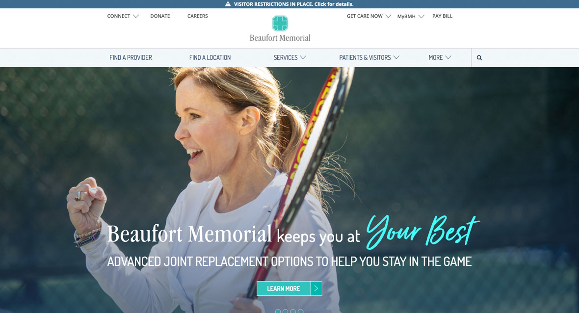
In combination with our analytical assessments and the organization’s strategic goals, we decided it was time for a home page refresh.
SOLUTION:
We took the heatmapping and analytical assessments and used that to make informed decisions about where we could improve the site performance and user experience. From our assessments, we saw that users weren’t scrolling far down on the home page. Additionally, we saw quite a few usability issues on mobile.
We cleaned up and simplified the main navigation and called out the set of quick links just below the main banner image.
We added visual cues to the background of the home page to help draw the eye along and keep users engaged. We used color-blocking throughout the home page design to keep the design exciting. The use of left and right CTA images helped keep the eye moving throughout the new design.
We gave some depth to the footer to help call it out, whereas in its current state, it tends to blend in with the page content.
Most importantly, we focused on a mobile-first design.
SOME CLIENT DELIVERABLES:
Project Information
- Client:
- Beaufort Memorial Healthcare
- Date:
- October 2022
- Category:
- Strategy, UX, Design, Web Development

