WHAT WE DID:
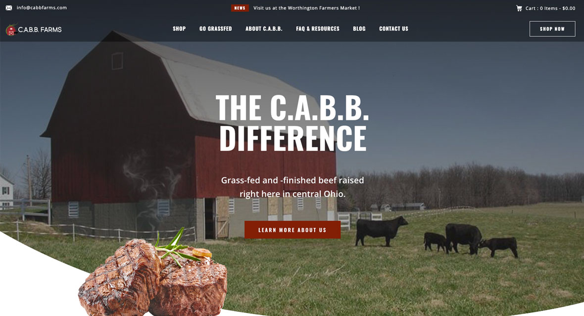
This local grass-fed and -finished beef farm is trying to grow their business. When we first met, they had no web presence at all. Their logo was a stick barn.
After several lengthy conversations about requirements and needs, we decided to move forward with a competitor and point of sale (POS) analysis. The family decided to use Square as the POS. For the interim, we built a Square site to get them through until I could develop a much more robust iteration of their site.
We also developed a new logo and style guide for their use. The grass swoosh around the logo was a last-minute request from the client, because they felt it was important to incorporate a grass element into the logo.
The site is currently in a dev environment waiting to be launched. The C.A.B.B. team and I have been working on an inventory best practice, so they can comfortably manage their stock for both in-person sales and online sales. Once the inventory side is determined, we will get the site launched. It is set up to pull directly from their POS to the site and maintain inventory levels for ease of administrative use. Best of all — it will easily integrate into their social channels post-launch.
This site is still technically in QA and UAT, so as you click through, you may notice some idiosyncrasies. That’s to be expected at this stage of development.
After the site launches, we will really begin pushing their marketing campaigns.
SOME CLIENT DELIVERABLES:
Project Information
- Client:
- C.A.B.B. Farms
- Date:
- TBD 2022
- Category:
- Branding, Strategy, Content, UX, Design, Web Development

