TRINITY HEALTH UNIFIED CONSUMER WEBSITE
BACKGROUND:
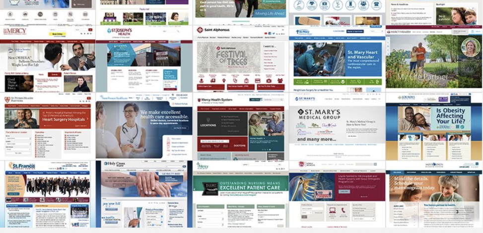
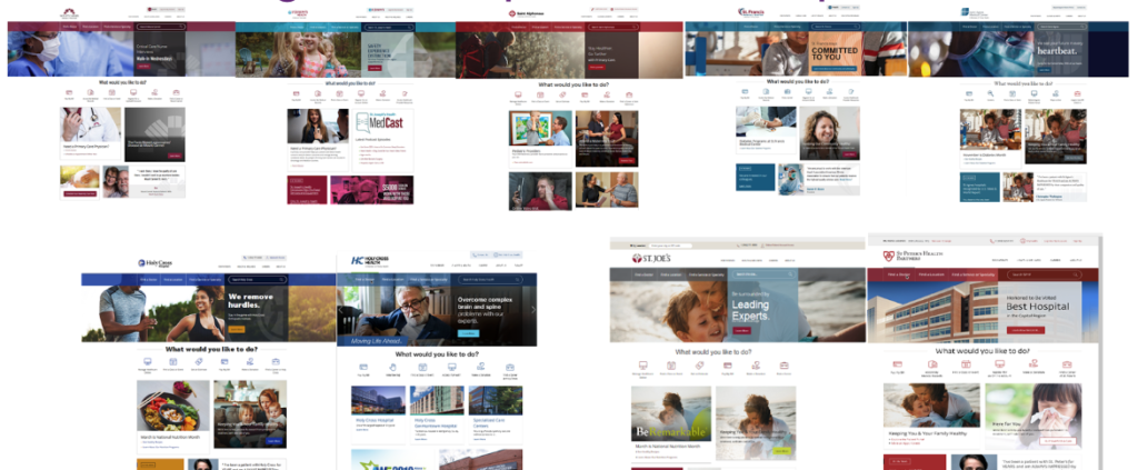
The vision of this project was to develop beautiful and inspiring digital front-doors for people engaging with Trinity Health and its member health systems, which span 22 states. By bringing over 26 disparate designs and IAs into a more templated approach, the system could realize real savings in terms of resources and cost.
The tricky part here is that each of the member health systems have their own unique brand and voice and layers of stakeholders, so we had to develop a very scalable design that utilized UX best practices built on sophisticated technology that allowed for local branding, content, and updating.
SOLUTION:
This multi-year project required a great deal of strategy. The 21-site project was originally slated to be a five-year rollout, but it got fast tracked to a two-year rollout. So, not only was this project challenging because of the many different UX and IAs we had to standardize and get approved through upwards of seven layers of stakeholders, we had to do it quickly and within budget.
We started with user testing on the existing sites to get an understanding of what was working and what was broken. We then did an IA and content deep dive to outline areas where we had content alignment and gaps. From there, we ventured into the analytics to get a better understanding of user flow and consumption on the sites. This helped outline the main navigational structure.
We also wanted to be mindful of how users are accustomed to searching and wanted to present them with a familiar Amazon- or Google-like search experience. The goal of all of this was to drive users to their point of conversion as quickly and seamlessly as possible.
Simultaneously, we developed and tested wireframes virtually asking people to use the “think aloud” method. These wireframes became the foundation of the design comps.
We then needed to narrow down how the individual brands could be built into the design comps so the local brands could still be showcased.
AWARD:
This design and UX won a Gold Hermes Creative Award for overall website design as well as a Silver Muse Award for health websites.
SOME CLIENT DELIVERABLES:
Here are some deliverables from my time at Mount Carmel and its parent company Trinity Health. Some of these are related to the Unified Consumer Website project while others are not:
EXAMPLE SITES & SUBSITES INVOLVED:
- Trinity Health
- Global Health Volunteers
- Holy Cross Health (FL)
- Holy Cross Health (MD)
- Life at St. Joseph of the Pines
- Loyola Medicine
- Mercy Health
- MercyLIFE of Alabama
- MercyLIFE
- MercyOne
- Michigan Cancer Research Consortium
- Mount Carmel Health System
- Saint Agnes Medical Center
- Saint Alphonsus
- Saint Joseph Health System
- Saint Joseph Mercy Medical Center
- Saint Joseph PACE
- St. Francis Medical Center
- St. Joseph of the Pines
- St. Joseph’s Health
- St. Mary’s Health System
- St. Peter’s Health Partners
- Trinity Health At Home
- Trinity Health Mid-Atlantic
- Trinity Health Of New England
- Trinity Health PACE
Project Information
- Client:
- Trinity Health
- Date:
- 2018 - 2021
- Category:
- Strategy, UX, Design
A glimpse at before....

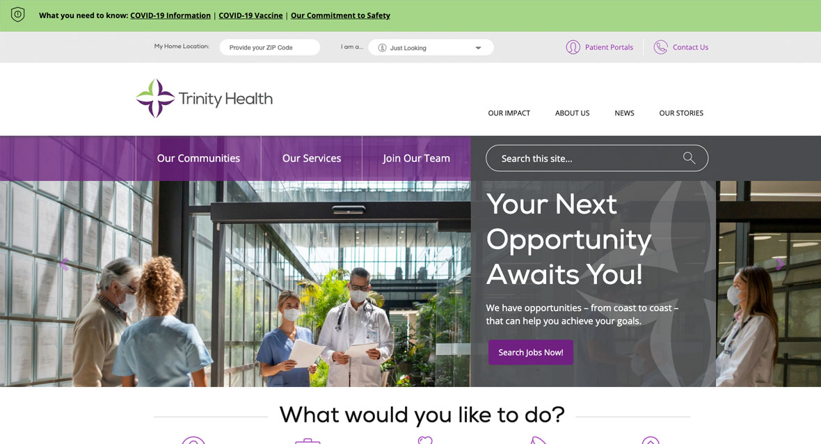
A glimpse at after....


